


Welcome to the new era of MLS third kits!
After scuppering third jerseys for years and limiting clubs to just two looks, MLS and Adidas dipped their toes back into third kits last season with a quartet of throwback-inspired looks. This season, they’ve ramped it up further with 10 more “heritage” kits, plus a standalone effort for Inter Miami CF.
While MLS is still a very young league compared to its counterparts around the globe, it’s in its 30th season now. It has its own history to draw upon and there’s nostalgia to tap into, which is exciting and exactly what they tried to do with these third kits.
Who has us yearning for 1996 and who gives us nightmares about the Macarena? Let’s take a look at all 11 third kits in MLS in 2025:
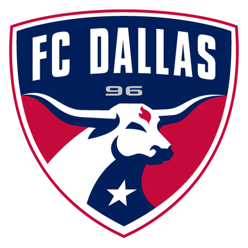
FC Dallas was the first MLS club to ditch their American-style name for something European inspired, doing so in 2005, and it set the stage for the past 20 years of the league’s naming convention. Before FC Dallas, this club was the Dallas Burn, and they’ve brought that unique aesthetic back for a gleaming third kit.
This one is based on their 1998 kit, with the old crest featuring the club’s mascot, horse Islamico, on the chest and striking red and gold hoops on a black shirt. It’s bold and immediately recognizable without being obnoxious. It wouldn’t stand out in a line of kits other than being more beautiful than almost any other. It makes you wonder why this can’t be the team’s permanent aesthetic again.
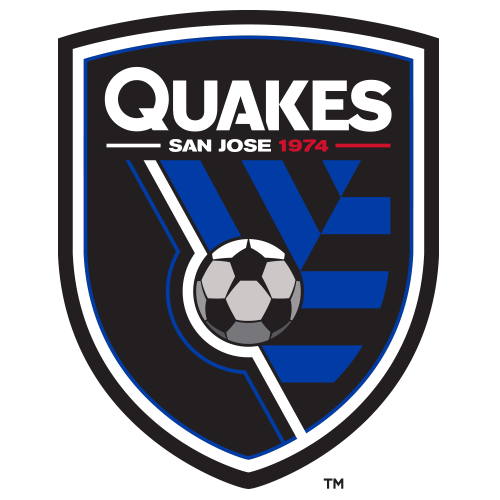
Dallas’ ’90s MLS throwback is unique, but within the norms of a soccer kit. San Jose’s is not in the slightest and it still goes hard as hell.
This kit draws from the 1996 kit, when the Quakes were known as the San Jose Clash and donned a white and yellow half-and-half shirt with teal triangles on the sleeves. This is a ramped-up version of it, with the angles from the triangle sleeves all over the front of the white shirt with yellow, teal and the red of the crest all worked in. It’s a lot, and you probably won’t see tons of people clamoring for San Jose to return to something like this, but something this bold and memorable is exactly what third kits should be like.
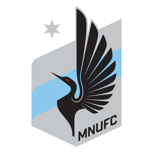
MNUFC couldn’t draw upon their own history because the club has only been around since 2010 and have stayed true to their original look, but Minnesota isn’t short on soccer heritage, so the Loons pulled from the Minnesota Kicks, Strikers and Thunder, who played in the NASL, MISL and USL over the decades.
Blue has been the dominant color throughout Minnesota professional soccer history, and orange has featured prominently for several teams as well, so that helps ground this kit. The orange is nice, in particular, because it’s a new color for the Loons and it’s used so sparingly that it really packs a punch in the trim. This kit is going to look especially good on the player wise enough to pair it with orange boots.
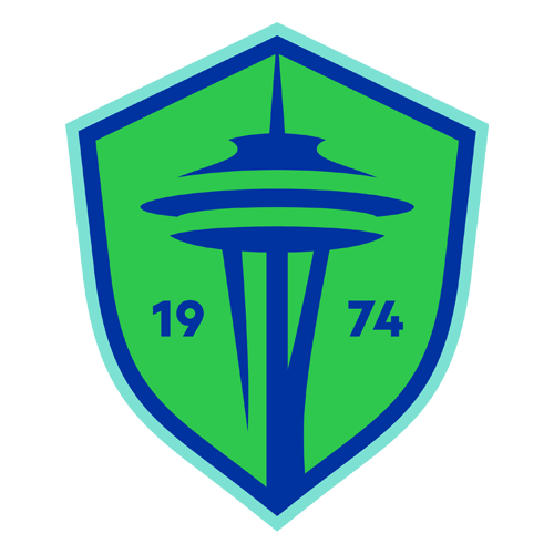
No team was offered a better opportunity with these retro third kits than Seattle, who got to celebrate the 30th anniversary of the old Sounders’ A-League title with this effort.
Everything about it looks so ’90s. From the teal accents, to the shoulder design and wave in the wordmark across the front, it transports you back to 1995. It’s kitschy, but not in a way that makes you roll your eyes. It’s true to the era and the Sounders.
As a bonus, the club got to use the orca logo that they debuted as a tertiary mark when they rebranded a year ago. The orca has been a smash hit and a favorite on all manner of merchandise. Now it gets a spot on the chest of a game kit.
It’s amazing to remember that the Revs used to wear a kit this bold and, well, garish on a regular basis. It’s one thing to have a shirt that’s blue at the top and red at the bottom, but add the white block for the wordmark and then some design elements that look like water colors across the chest? Obscene.
But as a third kit, it’s perfect. Just like the San Jose kit works great for special occasions, so does this one. It takes you right back the 1996 shirt that this kit is based on, when you could head to the movie theater and see a triple header of “Mission Impossible,” “Independence Day” and “Twister” before blasting Bone Thugs-n-Harmony’s “Tha Crossroads” on the way to Foxborough for the Joe-Max Moore show.
How do you design a heritage kit when your club is only four years old? You borrow from the city’s previous soccer history, which is what Charlotte did with this kit.
The yellow and blue comes from the old Carolina Lightnin’, which was the city’s first professional soccer club and played in the ASL from 1981 to 1983. It wasn’t a long history, but it gave the Crown plenty to base this kit on. They turned up the shade of yellow, making it neon and used the old ASL team’s logo block across the front. With that, a collar and the simple crown crest, Charlotte managed to come up with a kit that feels like a throwback but hardly stale. It’s a fresh and bright nod to the past that doesn’t feel in conflict with itself.
Once upon a time, D.C. was MLS’ most successful club with the most identifiable kit in the league. Three stripes across the chest and a trophy in hand screamed “United.”
It’s been a long time since those early days, and the club itself hasn’t always done a very good job of celebrating its own history, but this kit does. It’s simple and returns to the basic design that D.C. sported when it stood on top of MLS, but the little touch of gold and the pared-down red crest with red Adidas logo adds a touch of pop and class that really brings it all together.

8. Inter Miami
Inter got the only third kit in MLS that isn’t part of the heritage collection. After all, when you have Lionel Messi, you don’t need an excuse to sell another shirt.
There’s not much going on with this effort. It’s a straightforward shirt with the same crest, logo and sponsor, and not many design marks either, but that doesn’t mean it’s without merit. The light blue and pink colorway both screams “Miami” and looks beautiful. When you’ve got good colors that feel rooted in where you’re from, you’ve got yourself a fine kit.
Add Nashville to the list of clubs that are so new that they don’t have history to draw upon for their third kit, but NSC didn’t try to pull from an old club in the city’s history. Instead, they tried to imagine what a Nashville SC kit would have looked like in 1996.
It’s laudable that they didn’t bother trying to invent non-existent history or co-opt someone else’s for themselves and their ideas make sense. The denim-inspired accent colors and throwback Nashville wordmark across the front are some really nice things to work with, but they didn’t quite pull it off. They opted to use denim as a secondary color when it should have been a primary and it doesn’t look enough like denim at that, instead coming across as a regular ol’ blue. Had they fully committed to a denim kit, this could have been special.
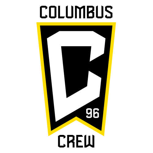
The Crew could have easily been near the top of this ranking. Their black and yellow is such a good combination, they brought back the old crest with the three men in hard hats, and for the first five years of the club’s history, they had some of the league’s boldest and most distinctive threads.
The problem with this kit is it didn’t really pull from those kits. There’s no shoulder stripes like their inaugural-season look, or sleeve hoops from the 1997 kit, or chest stripes from 1999. A club who proudly wore big design stripes in the early years instead opted for some chest marks that looks more like modern, template-driven designs fans so often deride.
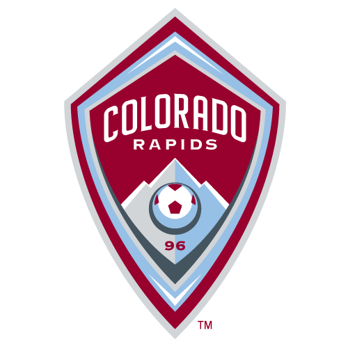
The Rapids’ burgundy and sky blue is a gorgeous color combination that rarely has people yearning for the green and blue that they wore from their founding in 1996, but that doesn’t mean the throwback colors don’t work. They look great, as does the throwback crest, which has more character than their current look.
There was a lot here for the Rapids to work with, but instead they went with a plain green collared shirt. It’s a shame, because third kits should not be understated, and it’s not working in harmony with the old logos that have tons going on. It’s not like Colorado only had simple kits back in the day either — there’s plenty of history of them having bold kits, so there’s no excuse for something so basic. It’s a complete missed opportunity.